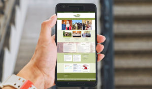
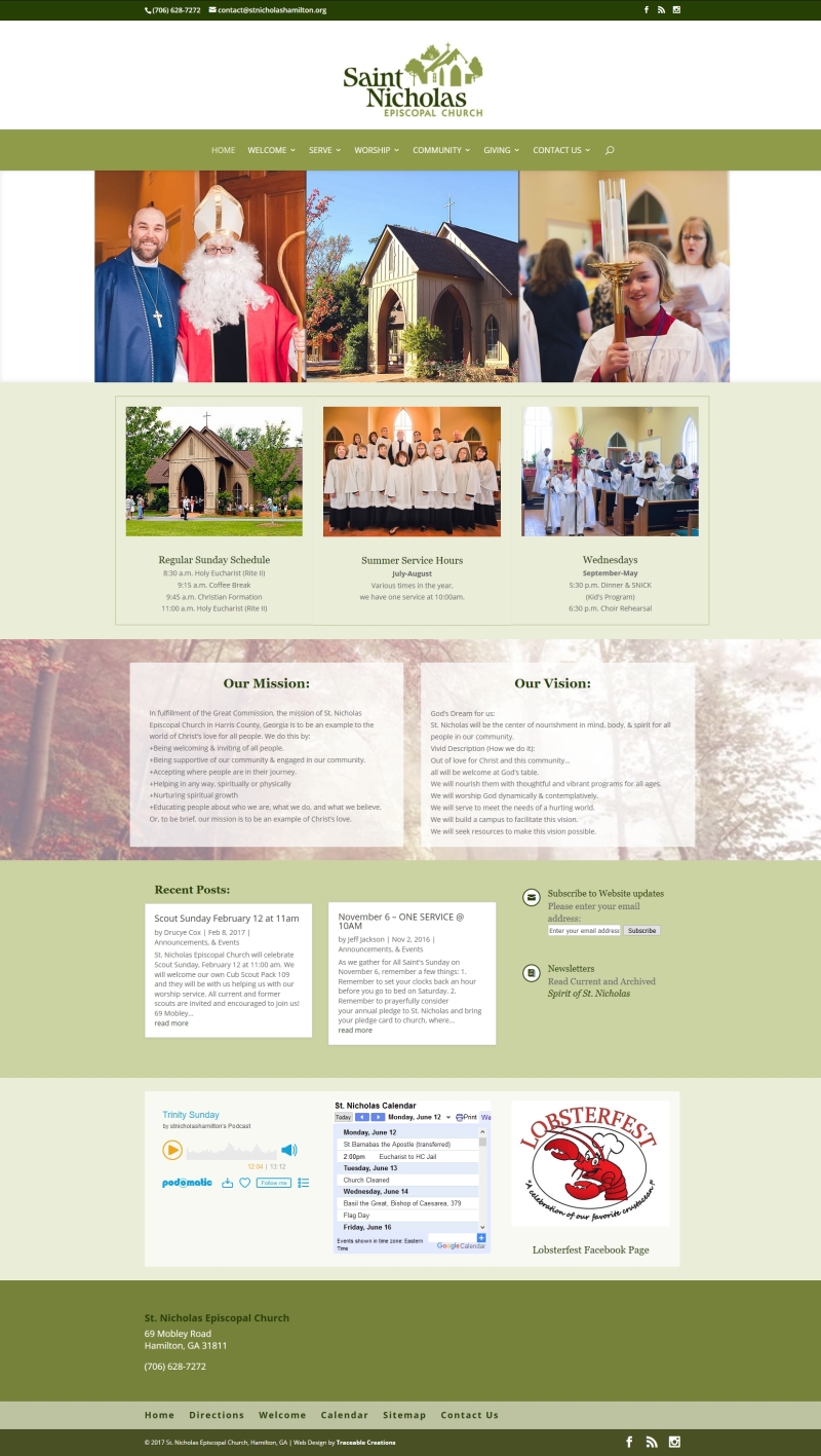
This was a redesign of a site that I didn’t build. It’s about 8 years old and chock full of good information but they’ll still need to determine what to keep and what to merge into less pages. Today’s websites need to have the mobile user in mind even more so than the desktop user. We need to deliver the information in less clicks and (sadly) less words.
It’s GREAT to see a church website that actually gets used!


http://stnicholashamilton.org/

